You spent countless hours in copy and design and review cycles crafting the perfect direct mail piece. Yet the finished product looks like junk mail, and your response rate suffers accordingly.
Why? Most likely the culprit is the lettershop – more specifically, the way your direct mail piece was personalized.
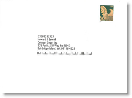
Here’s a recent direct mail piece from Dell. Elegant, ivory-colored (trust me), invitation-style envelope. Live stamp. No company logo (or even identifying mark), just a return address on the back flap. Clearly a mailer intended for the executive, right?  Except for one thing – in their zeal to save a few pennies on postage, or more likely, because Dell’s agency handed off responsibility to the mail house, the personalization is horrific. There’s a keycode directly above the address block and a barcode immediately below; both elements that scream out junk mail, essentially negating the entire effect.
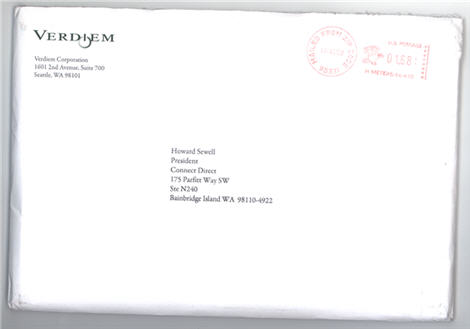
By comparison, below is a recent package our firm produced for Verdiem. We chose a serif font, meter vs. live stamp, and opted to omit the barcode because the extra few cents in postage was worth it (the mailing quantity wasn’t that high), all to make the package look more personal – in essence, a communication from one executive to another. What a difference.
Direct mail is making something of a comeback in B2B marketing (postage increase notwithstanding), as more and more companies look for a proven method of pushing their message to targeted lists of prospects, particularly non-technical, Line of Business (LOB) executives who simply aren’t as accessible via e-mail lists and other online vehicles. 
Just remember: the direct mail creative process doesn’t end at final layout. If you want your creative vision to arrive on someone’s desk as intended, here are a few tips to remember:
* Always give your lettershop specific instructions for how you want your direct mail to be addressed, particularly when it comes to font choices
* Don’t be religious about defaulting to the lowest possible postage rate, particularly if it means you’ll be forced to use barcodes
* Choose a font that makes the envelope look like it came from someone’s laser printer (think serif; we often use Garamond)
* A live stamp used to be a sure thing when you wanted your direct mail to look personal; however, today’s pre-sort stamps can look just as bad as a pre-printed indicia. If your mailing quantity isn’t that high, think about using a full-rate (42 cent) stamp. You’ll pay only pennies more in postage, maybe a little more in handling, but the effect could be worth it.
* Ask for live personalization samples to be faxed or e-mailed to you so you can approve them prior to the mail shop personalizing the entire drop
* Test. We once tested a client’s direct mail campaign with and without a barcode. The version without a barcode generated a 30 percent higher response.
Finally, a disclaimer: all of the above rules apply primarily to letter packages. If your direct mail piece is a postcard or self-mailer, no amount of care or fine-tuning personalization is going to make someone believe it’s anything but a commercial mailer.

Really great tips. I just bookmarked this post.
A quick tip from me: As I live overseas it’s a hassle with international delivery of postal mail. So I had sent test mailings to one of those service, that receive and scan your mail in the US (also to different locations, cross the country to see, if that makes a difference). You also can have those pieces forwarded to your international address from there. That’s as close to a real test as you can get when operating from overseas. — John
Thanks for the tips on direct mailing. I do alot of mailings and never thought to request not to have the barcodes on the mailings.