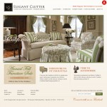
Your opinion is needed! One of our B2C clients, Elegant Clutter, is a boutique furniture and home accessories store in Danville, California. Spear is designing a new Website for the company and the client is having a hard time choosing between two home page designs.
Just click on the thumbnails below to view the two designs and then vote for your favorite using our instant poll. Any and all comments are welcome (include your age and city, if you feel comfortable doing so.) Invite your friends, colleagues or followers to add their opinion using the SHARE button.


Website A is much warmer than Website B.
Fred
Age 57
San Francisco
I know Elegant Clutter well! Boths sites are very representative of the store. While website A is much warmer, website B is more memorable(I knew right away there was a sale and felt complelled to make a note of the date!)
However the two pictures next to the “time to accessorize” and “furniture to fit your style” in Website B are small/hard to see as well as the text.
Text below the sale box a little fuzzy.
Best of luck! Elegant Clutter will be pleased.
My eyes were instantly drawn to Website B. The first thing I saw was the Sale, then my eyes went to the next two columns. In Website A, it’s pretty, but I didn’t even read the block that announced the Sale. Though A is more Elegant with the cursive writing and soft colors, it fails to grab attention like B.
Idea A has no real strong focal point whereas B tends to provide more visual routing. I agree with the first comment that A is warmer but I think that is a factor of the photo, not the design.
A is a much better picture of the store, but the ad in B stands out better. I vote for A, just change the color of the ad.