Two e-mails arrived in my inbox recently that merit dissection. They’re from two competitors – Oracle and Netsuite, respectively – and both promote Webinars that are thinly disguised versions of “Why You Should Buy Our CRM Product and Not Our Competitor’s”. Topic aside, however, I’d wager that head-to-head the Netsuite version would draw a much higher response. First, here’s the e-mail from Oracle:
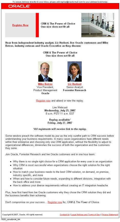
There’s so much that’s wrong here it’s difficult to know where to start. Easily the biggest crime is the fact that you’re forced to scroll down three-fourths of the length of the e-mail to have even the faintest whiff of why someone would want to attend the event in the first place.
When an e-mail displays in the recipient’s preview screen, you have only a split second to convince that reader to open the e-mail and read further. Here, Oracle has chosen to utilize precious real estate – the very top of the e-mail – for an unsightly box (“Register Now” – a little premature when I have no idea what the event is about), the title of the event (more about that below), and a generic stock photo that has no relevance to the topic.
The title of the event is particularly egregious: “CRM & The Power of Choice: One Size Does Not Fit All”. If I attend a Webinar, I want at least a hint in the title of what benefit I’ll glean from the event. There’s no benefit here – just a sense that I’m about to be lectured by Oracle on what not to buy. No thank you.
I’m a big fan of including speaker photos in invitations – it makes the event more “real”, more credible – but not this way, when the photos dominate the entire e-mail, and push the more critical selling copy well below the “fold”.
Oh I could go on and on:
Promoting a replay to be available two days after the live event and destroying all urgency for attending the event in the first place …
Weak selling copy: “Why CRM is most successful when organizations choose the right solution for the right situation” (wow – really?) …
and my personal favorite: “Hear first hand from live Oracle customers why they chose the CRM solution they did and the business benefits their (sic) achieving.”
Ouch.
In marked contrast, here’s the invitation from Netsuite:
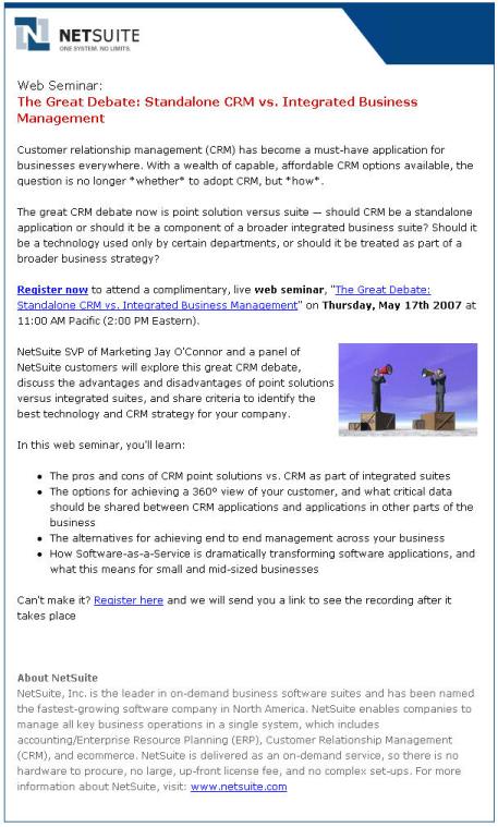
First, note the absence of gratuitous stock photography and other useless design elements that only display as white boxes in Outlook anyway. The look and feel is simple, yes, but also professional, consistent with Netsuite’s brand, and most importantly: functional.
The title isn’t much better than Oracle’s, but at least it’s informative, and detailed enough that I get an immediate sense of what I’m likely to learn.
The invitation launches immediately into selling copy, but it could be improved. The first two paragraphs “set up” the invitation by describing the decisions facing businesses when it comes to choosing a CRM solution. This is a classic “so what” opening – telling the reader something he or she already knows (see “two common e-mail copywriting mistakes“). I’d much rather see a strong, benefit-oriented statement: “In just one hour, learn the secrets to choosing the right CRM solution for your company” or similar.
But I’m nitpicking. The selling copy is followed by a clear and strong call to action, a description of the event, and some well-written (and correctly spelled!) bullets. Stock photography makes its obligatory appearance, but it least it’s not forcing copy down the page. Again, I’d replace it with a photo of the speaker.
Netsuite also offers the option of viewing a replay, but they don’t mention when the replay will be available, and somehow the copy doesn’t lose its urgency as a result. It’s just one more reason to register immediately.
There’s potential for improvement here, but overall, this is a well-written, well-designed, invitation created by marketers who understand e-mail as a creative medium. Well done.
Learn the most common e-mail missteps, and how to avoid them. For a free copy of our white paper, “Top 10 High-Tech E-Mail Marketing Mistakes”, click here.


Like you say, Howard, the NetSuite email is/was likely to draw a higher response. Though like you also say, there’s certainly potential for improvement in the NetSuite one too.
This is rough, but here’s another take on how the NetSuite email could be more concise.
–
Title:
Web seminar
How to Choose the Appropriate “CRM Strategy”:
A Rundown of Criteria to Guide You
Body copy:
On Thursday, May 17, 2007, from the convenience of your desk, hear a panel discussion that will help you put in place — or fix cracks in — your organization’s CRM strategy.
When the web seminar is over you’ll have a better sense of the criterions you need to consider, not all of them obvious.
NetSuite SVP of Marketing Jay O’Connor and a group of small and midsize NetSuite customers will share their experience and wisdom on the following:
* What are the pros and cons of CRM used on its own?
* What are the pros and cons of CRM as one component of a larger “suite”?
* What data is most important to feed into CRM system? (It may or may not be what you think.)
Comment: Then the same “Can’t Make It?” paragraph they used, which I agree is phrased effectively.
–
Also, Howard, I wonder if using the boilerplate at the end *helps* or *depresses* response.
In this case, I wonder if it *depresses* response because it’s promoting the *company* vs. what the reader really cares about — the *offer* (the webinar).
And, one could conclude from the boilerplate text that the company only offers the “suite”…leading the reader to believe the company doesn’t offer standalone CRM as an option.
(This could be fixed by rephrasing “manage all key business operations” to “manage some or all key business operations”)
Great comments Mike. I agree with you about the company boilerplate, though it’s so far down the e-mail I doubt it has much effect one way or another. There’s no harm in reminding people what you do or who you are, but this one seems overkill, and more importantly – as you note – distracts attention from the offer. Also, they close with a link to the home page, which has the potential to distract the reader from the true call to action: to register for the event.
Hi Howard,
Whenever I review pieces like this, I always look to see where my eyes lead to, and that’s where so many of these miss the boat.
The eyes should be be drawn to the main message, or to an image then to the headline below it, and then to the rest of the copy.
The Oracle one is a disaster because your eyes go to the photos. How many readers don’t go back up and read from the top? Lots, I’ll bet.
The Netsuite headline grabs you because of the red font…then you naturally read on from there.
If there’s one principle I try to install in designers or marcom professionals it’s an awareness of eye movement. If it’s not right, the piece often loses it’s effect.
Now here’s a bigger question. Oracle has been in business for how long?
So you have to ask why they still produce pieces like this.
To me, this is like like shipping software with a crashing bug. Just as a piece of software won’t work with a crashing bug, so also will marketing pieces “not work” with crashing bugs like the one in the article.
Time to install marketing best practices, and some marketing QA before the piece is sent to thousands of customers…just as in software development!
Cheers,
Frank
Frank: Agree 100% with your comments. In defense of Oracle (and as a former Oracle-ite myself), they’re a big enough company that I suspect this is not the work of corporate marketing, but rather a rogue group outside the purview of people who should know better. Is that an excuse for bad creative? No. But I suspect it’s the answer to your question.
Great post. I also like Mike’s rough cut of the email copy. Additionally I think the NetSuite email can be improved by having scannable copy. The bullets are a good start but they are on the bottom of the email and they are on the long side.