In early 2014, Sungard Availability Services (Sungard AS), a leading provider of managed IT, cloud, and recovery services, announced that it was splitting off as a separate company from SunGard Data Systems Inc.
Sungard AS asked its demand generation agency, Spear Marketing Group, to help introduce business prospects within the company’s marketing database to the new brand. This was a critically important initiative because Sungard AS employs an extensive lead nurturing program (that Spear helps design and manage) to maintain brand awareness within that database and convert prospects to sales opportunities. One of the significant risks inherent in the split-off was that those prospects would react differently, or not at all, to the new brand.
The goal of the campaign was to forge an immediate connection with the new brand for those prospects who had been interacting regularly with the old company. In essence, Sungard AS wanted to get the message across that they were still the same great company — just with a new look and feel.
This presented a challenge. Busy IT executives, who form the majority of the Sungard AS prospect base, receive hundreds of emails every day, many of them from vendors like Sungard AS. Even under the best of circumstances, it usually takes a compelling business message, and information of significant value, to coax a response from an audience that is constantly bombarded with promotional emails.
 In this case, there was no offer per se, no white paper or Webinar or other information of value. Sungard AS was simply announcing a brand. But it was critical for the company that they inspire prospects to explore the new Website, and take note of the new brand in a way that would ensure those same prospects weren’t disoriented when they started to receive emails with a revamped look.
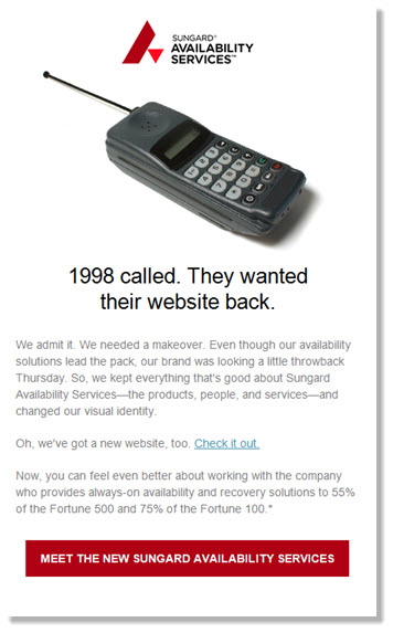
To achieve this, Spear developed a “visual bridge” leveraging Sungard AS’ new brand identity in a fun and conceptual way, using imagery and copy that was starkly different from most other marketing emails, or anything that the prospects had seen previously from the company.
The results were startling. The campaign generated click-through rates (CTR) that were more than 450% higher than average, and the emails drove almost 4,000 unique visits to the new Website.
“There is [a] very significant quantitative business impact gain we can cite from this campaign, and that’s engagement with our new brand,” said Sungard AS’ Director of Marketing Programs, Julie Brewer. “When we set out to develop this campaign, we knew that the ultimate measure of success was having as many prospects as possible engage with our new brand, thus opening the door to making more meaningful connections with them once our nurture campaigns kicked off.”
“We believe the decision to use humor for this campaign had a significant impact on its success,” commented Gilda Raczkowski, Spear’s Creative Director. “Our concept poked fun at the client’s brand by implying (tongue in cheek) that it was “out of touch” and needed a refresh. We also believed that deprecatory humor would help inspire a connection between the company and its prospects.”
Even then, the email was designed primarily to generate response. The overall layout was simple, and the call to action (Visit the Website) both straightforward and prominent. Spear created two versions of the campaign, both with the same message but a different visual and slightly altered headline. Company messaging was kept to a minimum, along with any other copy that might be construed as a “pitch.”
Ultimately, the campaign asked little of the prospect and Spear believes that the combination of an eye-catching visual and a straightforward call to action made for an easy decision to click. Given the success of the campaign, Spear is now testing a similar, more visual design in other Sungard AS programs. (Typically, best practice frowns upon large images in emails, so this approach was a significant departure.)
