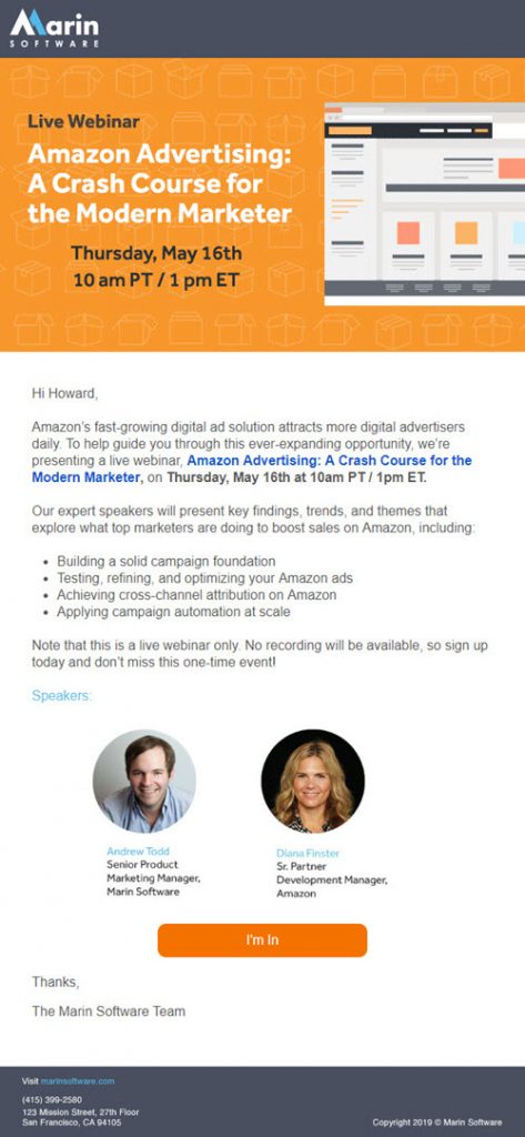
One of the real-life campaigns I included in my presentation last week – A Crash Course in B2B Email Creative – at SiriusDecisions Summit in Austin, was this Webinar invitation from Marin Software. I’ve written often about the dismal state of B2B creative, so it’s good to see at least one B2B company get it right.

Here’s what I think makes this an effective campaign:
* The offer is front and center. I know immediately, at a glance, without scrolling, that I’m being invited to a live Webinar.
* The body copy opens with a statement of fact: “Amazon’s fast-growing digital ad solution attracts more digital advertisers daily,” but it’s a short opening, and from there the copy jumps right into information about the offer and why the reader should attend. Too often, B2B emails open with a long lecture about the state of business and industry trends (classic example: “As a busy marketer, you know …”)
* The email offers clear, specific, and concrete learning benefits (the 4 bullet points) – what the reader will learn, gain, discover by attending the Webinar. Note that none of this has anything to do with why you’d want to do business with Marin. One of the key principles of B2B email creative? Sell the Offer, Not the Product.

* In a break from standard practice, Marin states that no recording of the event will be available. Personally, I love this. Too many tech companies do the opposite – i.e. tell the reader that if he/she can’t make the live event, a recording will be sent to them. Not only does this devalue the live event, it’s almost guaranteed to decrease attendance. Why would I bother showing up?
* Speaker photos make the event more “real.”
* Creative button copy: “I’m in.” There’s no rule in marketing that a CTA button on a Webinar invitation has to say “Register Now.” Mix it up! (Just don’t ever use “Submit”.)
In sum, this is a compelling invitation where virtually every word of copy is driving action and selling the value of the event. Here’s what might make the email even better:
* Add a CTA button to the header. Sure, there’s a text link in the first paragraph, but it’s not immediately and intuitively obvious. Some readers might be forced to scroll to the CTA button at the end.
* Avoid first person and passive language. “We’re presenting a live Webinar” would be more effective as: “Join us at an exclusive live Webinar …” You could then hyperlink a call to action (“Join us”) instead of the title of the Webinar.
* Eliminate both the salutation (“Hi, Howard”) and “Thanks, The Marin Software Team” at the end. This is not a personal note or even sales outreach. We’re not fooling anyone. Salutations may feel like “personalization,” but here, it’s just taking up valuable space, forcing more important selling copy down the page.
For a more detailed view of what makes for a great Webinar invitation, download our white paper: “Top 10 Tips for Webinar Invitation Success.”
