In B2B email marketing, does short copy always win over long? Not necessarily. The answer depends on your audience, the complexity of your message, and how well the copy maintains the reader’s interest and drives action.
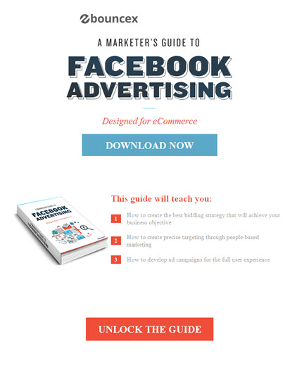
You won’t see or find many shorter B2B emails than the one below from BounceX, a New York-based developer of “behavioral automation tools for digital marketers.” Sure, it may not win many design awards, and yet, in a mere 53 words, the company elegantly and concisely presents both a compelling offer and a strong call to action. To me, this is a campaign that works.
 What you don’t see in this email are many of the things that commonly bog down B2B campaigns, to their detriment, notably a tedious introductory paragraph designed to grab the reader and “set up” the business case for why he/she wants the offer. So, for example, BounceX could have led their email with something along the lines of:
“At 1.4 billion active users, Facebook offers a unique and compelling platform for reaching the world’s consumers. But what’s the best way to get the most from your Facebook advertising investment?”
But they didn’t. And that’s a good thing. Intro paragraphs can be effective – and even imperative – in situations where, as is often the case in technology marketing, you need to first convince the reader that he/she has a problem or opportunity worth addressing in the first place. But here, that’s not needed. In fact, BounceX doesn’t even try to convince me that Facebook advertising is difficult, or complex, or tough to manage without their advice. They just offer free information on how to be successful.
The email really is a masterpiece of brevity. Here’s the sum total of what’s included:
• the name of the ebook, serving double-duty as a headline
• a sub-head that cleverly makes the offer more attractive to its intended audience (ecommerce marketers)
• a wonderfully realistic thumbnail image of the ebook
• 3 bullet points succinctly explaining what you’ll learn
• a call to action, repeated twice
That covers what I like to call the 3 key elements of any successful email:
• The What (Offer)
• The Why (Benefits), and
• The How (CTA)
in less space than it would take most of us to ask a colleague where he wants to go for lunch.
Now if I were being really picky, here’s what I’d change:
• in my email client (Outlook) the logo is off-center. I doubt it impacted results, but I find it distracting.
• the headline “A Marketer’s Guide …” is an image, not HTML, so for any email client with images turned off, all you see is a white box. The image makes for a more attractive email, but I would have repeated the name of the ebook in the body copy, just to make sure people know what they’re signing up for.
• the bullets could be stronger. Learning benefits are best when they’re concrete and specific. Phrases like “to achieve your business objective” and “for the full user experience” come off (to this reader) as generic, and thus of lesser perceived value.
• The subject line (unseen here) is: “3 tactics to maximize ROI from your Facebook ads.” I like the message, and the reference to what I’ll learn, but there should be a stronger tie-in between that promise and the payoff in the actual email. I’m guessing that the 3 bullet points are intended to be the 3 tactics, but it’s not 100% clear, and that’s a disconnect for me.
• I’m not a fan of “Unlock the Guide”. It’s cute, but it makes me pause. Unlock? What am I being asked to do here? Will I be asked for a code? I would have opted for something less cryptic, like “Get the Guide Now”.
For more tips on B2B email marketing, download a copy of our free white paper, “Top 10 B2B Email Marketing Mistakes.”
