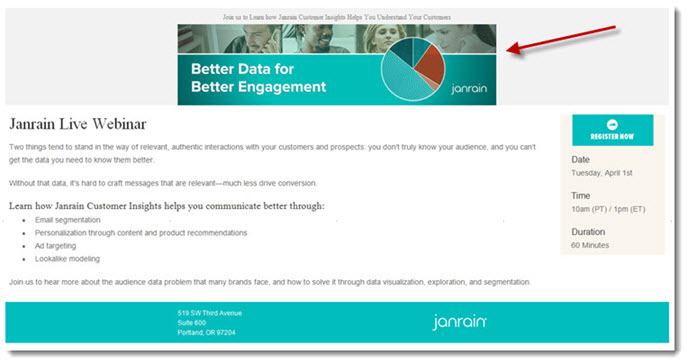
I wrote recently in this space about the decisions that today’s B2B email marketers are facing as they strive to ensure that their campaigns are optimized for an increasingly mobile audience. The Webinar invitation below from Janrain, a software company in Portland, Oregon, illustrates some of the perils inherent in those choices.
The base template for the email appears to be a responsive design, but the main header image is a fixed width (it neither expands nor shrinks), so when the body of the email expands to accommodate a larger screen, the header image immediately looks awkward, and disjointed from the rest of the design – more like a banner ad on a Website.
My suspicions are these:
1. The header graphic was developed independent of the email design as a whole, and thus not integrated into the overall user experience;
2. Janrain failed to test the email fully before launching. Emails that may look magnificent as static designs can often run afoul of certain email clients, particularly in the mobile sphere. (At our agency, we use Litmus, an online service, to test email designs across a range of technologies, including Outlook, Gmail, iPhone, etc., before the campaign goes into final production.)
I asked Steve Reinhardt, Spear’s manager of Web development, what he’d do differently:
“I’d recommend using CSS media queries to have the header graphic change to a “mobile friendly” width when the email is narrowed to render on a mobile device. This would allow for the layout below to better adjust as well. Or, design a header image that can scale up or down in size while remaining readable.
A third option is to simply make the header a solid background color (instead of a gradient) with text that resizes based on the device, like the footer does here. This would reduce the amount of images, speed up load time, and give more flexibility to font size on each device. Ultimately ‘less is more’ when it comes to responsive emails.”
Now, did a slightly awkward-looking header image doom this campaign from the start? I doubt it. More problematic, in my view, is copy that does little to communicate the value of the actual event, and instead resorts to a litany of product features and limp generalities about that product’s value proposition. For example:
• The headline “Better Data for Better Engagement” (which is also the subject line) could mean a million different things to as many people. It implies a benefit, I suppose, but only if you already know what kind of “data” and “engagement” that Janrain’s solution improves.
• The subhead “Janrain Live Webinar” is wasted real estate in a key location – above the proverbial fold – where the writer needs to make sure the reader understands What the event is, Why it’s of value, and How to register. (Notice that the only call to action anywhere in the email is in the sidebar, a button that will be rendered invisible with images turned off.)
• The two paragraphs that follow the subhead make the classic copywriting mistake – attempting to “set up” the offer by offering up a relevant business challenge or statement of fact. In this case, said statement is so generic (“you can’t get the data you need”) that the reader (well, this reader anyway) is left wondering what the heck they’re talking about.
• When finally the invitation turns to why I should attend the event (“Learn how …”) the copy both omits a clear opportunity to include a call to action (e.g. “Register for this exclusive event today and learn how …”) and then launches into a laundry list of product features.
From all appearances, this Webinar is actually a product demo. There’s nothing wrong with that, per se, except the invitation would be more effective if it were stripped of any pretense of being educational, and simply promoted as an opportunity to experience new technology.
For more email tips, download a copy of our white paper: “Top 10 B2B Email Marketing Mistakes.”

