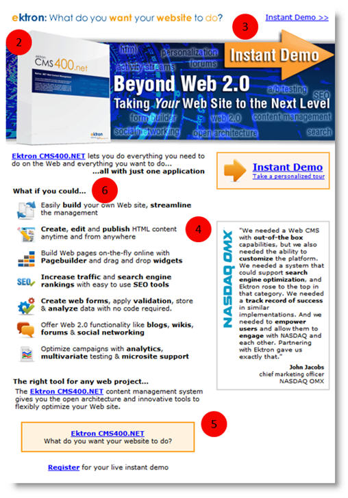
As data sheets go, the design below from Ektron, a New Hampshire-based developer of CMS (Content Management System) software, has its merits. Unfortunately, it’s not a data sheet, it’s an email, and on that score, it breaks virtually every rule in the book. Let me count the ways.
1. Not seen in this image is the subject line: “Download this tool for your Website.” I guess you could call that the “direct approach,” but as a subject line, it’s completely devoid of any benefits, any mention of the offer, or any compelling reason for me to open the email and read further.
 2. The first 3 inches or so of the email is dominated by two graphic images: the tagline “ektron: what do you want your website to do?” and the header image containing the headline “Beyond Web 2.0 – Taking Your Website to the Next Level.” Most email readers (with images turned off) won’t see either.
Instead the first thing most readers will see is the copy: “Ektron CMS400.NET lets you need to do everything you need to do on the Web and everything you want to do.” Happy to know it, but why should I care exactly?
3. To Ektron’s credit, the call to action – registering for an instant demo – is repeated 4 times throughout the email. However, at no point do I really learn more about what it is I’m signing up for. There’s a complete absence of detail about the offer – how long the demo takes, what I’ll see/hear/learn, etc. Remember, one of the first rules of email marketing is: Sell the Offer, not the Product.
4. Instead, most of the body copy consists of a listing of product functionality. To be fair, the bullet points offer benefits (increase traffic, optimize campaigns) as well as mere features, but this laundry list approach begs the question: what are we selling? If you’re asking me to buy the product, fine. But if you want me to take a demo, then sell the demo. And what’s with the icons? All they do is add clutter.
5. For all I know, the Ektron CMS may be a fine product, but the messaging employed here is horribly vague and generic. Prime examples are: “What would you want your Web site to do?,” “… lets you do everything you need to do on the Web,” and “… the right tool for any Web project.” We could just as easily be selling a browser.
6. Too many questions. “What do you want your website to do?” is a cute tagline, but it doesn’t belong in an email like this one. Asking questions in general puts the onus on the reader to decide whether he/she should read further. Much better to turn those questions into hard-hitting benefit language that supports the offer. See also the line preceding the bullet points: “What if you could …” This would be much more effective if it read: “Sign up for your 5-minute instant demo now, and learn how you can …”
Ektron is proud of their software – that much is clear. Unfortunately, in my view, they’ve let extolling the virtues of that product get in the way of what should be the primary purpose of any marketing email: getting people to respond.
For more tips on improving email effectiveness, download a copy of our white paper: “Top 10 High-Tech E-Mail Marketing Mistakes.”
