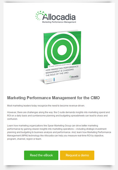
Here’s a list of the things I love most about the email below from Allocadia, a Vancouver, BC-based developer of Marketing Performance Management (MPM) software:
Yeah, that’s about it.
Seriously though, that is one gorgeous white paper. It’s visually stunning, professional, colorful, even the title is intriguing (“How Marketing Performance Management is Changing the Role of the CMO”). It looks real and tangible and worth downloading. And, as the primary offer, it’s front and center in the email, which (as readers of this blog will be tired of me preaching) is one of the keys to B2B email success.
Alas, the rest of the email is really, really bad. Let me count the ways:
The aforementioned white paper image is HUGE. Hey, I’m all for drawing attention to the offer, but with images turned off (true for as much as 40 percent of email clients, according to industry research), said offer is a big white box that does nothing but force valuable selling copy down the page. (In fairness, it could have been the offer image that drew me in, but then I’m the “images on” type.)
 The headline, “Marketing Performance Management for the CMO”, reads like the proposed title for a college marketing course. There’s no implied benefit, nothing action-oriented (Discover, Learn), nothing to grab the reader.
The first two paragraphs of body copy, starting with “Most marketing leaders today recognize the need …”, are a mind-numbing recitation of facts of which any decent CMO is already well aware. One of the key tenets of effective email copy: don’t tell people things they already know.
By now, most readers are lost. However, it’s only now, a full two-thirds through the email, that I’m offered any semblance of WHY I would want to download the white paper. No, scratch that – there’s in fact no mention of the offer whatsoever, so when the writer says “Learn how marketing organizations can drive better marketing performance …” I can’t even be sure that the white paper is my route to that knowledge.
Furthermore, the gratuitous mention of Allocadia’s product (“… learn how Marketing Performance Management (MPM) technology like Allocadia …”) is not only unnecessary, it now makes me suspect that what I thought might be an informative white paper is nothing but a product brochure in sheep’s clothing. (Remember: sell the offer, not the product.)
Two missed opportunities in this paragraph: one, connect learning benefits back to the offer, as in: “In a free ebook from the experts at Allocadia, learn how …” And secondly, include a link to the landing page somewhere (anywhere!) in the text, so that the call to action appears earlier in the email.
In fact, the only call to action is at the very end of the email, in the form of not one but (“wait, there’s more!”) TWO buttons: one for the ebook, one to request a demo. Another cardinal rule: business email should focus on one offer, and one offer only. Anything else is a distraction. Furthermore, though buttons are generally considered more mobile-friendly, they’ll also be invisible to any email client with images turned off, which leaves the email lacking any call to action whatsoever.
But what a beautiful white paper. (Sigh.) I had such high hopes.

