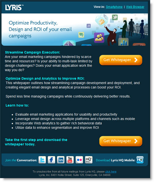
Can a campaign about how to improve email design be a prime example of how NOT to design an email? If it’s the campaign below, received this week from Lyris, an email marketing software company, the answer is (in the view of this blogger): yes.
Let’s start with the subject line (not seen here): Optimizing Email Productivity and ROI. First, almost the entire phrase is a marketing cliché: optimizing, productivity, ROI. Productivity alone is the biggest throwaway term in marketing; it means absolutely nothing. And if you must use “Optimizing” (a horribly over-used word), why not “Optimize”? At least then you’d be stating a benefit in an action-oriented way, and not simply a topic.
Second, the subject line gives no clue as to what the offer is (a white paper) and thus provides virtually no reason to read the email, unless I’m in the mood to optimize email productivity, whatever it is that means.
 Now to the email itself. The header itself, with its odd, faintly psychedelic clipart, is one big image. Which means, if the reader has his/her images turned off, like most do, the headline (clichés and all) will never be seen.
The sub-heads (“Streamline Campaign Execution” et al) are written as if for a brochure (i.e. as titles for sections of content) rather than for an email. In an email like this one, sub-heads serve to break up the content, but they also work to grab the reader if he/she scans the copy at a glance. As such, they should be action-oriented and tie back to the offer, for example: “Learn how to streamline campaign execution.” Here, they’re just topics, and fall flat.
The body copy opens with a litany of Yes/No questions: “Are your email campaigns hindered by scare time and resources?” and so on. As I’ve written previously in this space, the problem with Yes/No questions is that they put the onus on the reader to decide whether he/she should read further. If the answer to any of the questions is “no,” you’ve lost the reader immediately. Much better to convert the questions to action-oriented benefits, for example: “Pump out email campaigns quickly regardless of bandwidth or resources!”
Worst crime on display here: the offer is completely buried. Sure, there are the two bright orange buttons to the right (invisible if images are turned off, by the way, rendering the email completely devoid of any call to action.) But otherwise, I’ve no idea what the offer is until the second paragraph, when the copy reads (strangely) “This whitepaper …” as if I’ve been introduced to it previously but somehow missed it.
Potential fixes: Add a thumbnail image of the actual offer. Introduce the offer in the header using a sub-head or caption. And mention the offer in the first paragraph, so the reader knows immediately why he/she should read further. (To Lyris’ credit, they don’t mention their product anywhere in the copy, but that doesn’t help much if I don’t know what it is that’s on offer.)
Personally, I’d vote against including the social links at the bottom of the email. It seems the jury’s out on whether adding social links to marketing emails increases total response, but my strong feeling is that a row of logos like this one is a distraction from the primary call to action. Give the reader one message, one offer, and one call to action; anything else is confusing. Once someone responds – either at the thank you page or in a fulfillment email – then by all means get them to engage with your brand. Here, it seems premature.
