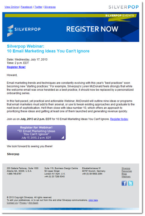
How do you prevent your Webinar campaign from being lost in the crowd? Here are 7 mistakes you’ll want to avoid, as illustrated by an email received recently from email marketing provider Silverpop:
1. If you must use a graphic header, make it count.
Graphic headers are a necessary evil in HTML email design. On the one hand, they add an element of visual interest and enable you to highlight a key selling point. Handled improperly, however, they do little more than push vital selling copy down the page, all for what most email clients (with images turned off) will see as a white box. In this example, the entire header is one image, so none of the copy will be visible to most recipients. Secondly, the only message is “Register Now.” That’s not a reason to attend; it’s just a very premature call to action.
 2. Sell the content, not the company.
By my count, the name “Silverpop” appears 9 times in this email, if you include the subject line (“Silverpop Webinar: 10 Email Marketing Ideas You Can’t Ignore”). Even if the company’s a thought leader in its space, littering the brand throughout the email in this way is complete overkill. Silverpop is not the message here (or at least, it shouldn’t be.) The reason people will register for any Webinar is because they believe the information presented will be of value. Keep the branding to a minimum.
3. Avoid first and third person where possible.
One of the simplest ways to make your email resonate with your audience is to talk to the reader directly, in the second person (as in: “you’ll learn …”, “you’ll hear …”) Here, Silverpop presents the content in the third person, as in: “McDonald will outline nine ideas or programs that email marketers must add to their arsenal.” Now that may be an interesting topic to some, but phrased as such, it reads like a meeting agenda, not an invitation to act.
4. Use bullet points to call out key selling points at a glance.
Studies show that emails often get read at a mere glance, usually in the preview pane, and so one of the most effective ways to ensure that key messages, and reasons to attend the Webinar, are highlighted, is to break the copy into bullet points that spell out those learning benefits. Here, what benefits there are (see #5, below) are presented en masse, lumped together into one paragraph.
5. Offer concrete benefits, not vague generalities.
All that matters in a Webinar invitation is to convince the reader that investing 45 minutes or so of his/her time will be worthwhile. To do so requires describing the benefits of attending – what the attendee will learn, see, hear – in specific, concrete terms. In the Silverpop campaign, there are precious few specifics; only hints and generalities. For example, “nine ideas or programs that email marketers must add to their arsenal.” Why? How will my emails benefit? What specifically will I learn?
6. Avoid gratuitous social inks and other navigation.
A Webinar invitation has one goal: getting the reader to register for the event. Presenting any opportunity to do otherwise is a distraction from the primary call to action, and almost guaranteed to lower response. Here, Silverpop includes top navigation (Facebook, Twitter, Website) and a footer with contact information, more links back to the main Website, and yet more social links. None of them are needed, and all of them detract from the primary goal of the campaign.
7. Buttons are calls to action; not post-its.
Buttons are useful devices in email design. They reinforce the primary call to action, add visual interest, and serve to break up the copy. What they’re not is billboards. Here, for some reason, the designer chose to cram the title of the event, the date, the time, and the call to action on one button, and all in a thin white font on a purple background, to boot. A much better option would be a simple “Register Now.”
For more tips on how to improve the success of your Webinar campaigns, download a free copy of our white paper on “Top 10 Tips for Webinar Invitation Success.”

Howard, thanks for a great blog post. I/we actually agree with your points – we have fallen victim to “the cobbler’s children go barefoot” syndrome – and need to revise our template and copy approach.
That said, here is the ironic thing – this Webinar had the highest number of registrations of any Webinar in the 13-year history of Silverpop.
So while I don’t disagree with you – it was still incredibly successful. And whatever failings the copy and design had – it still knocked it out of the park. But, yes, perhaps we could have had even more …
Loren, thanks so much for your comment and congratulations on the success of the Webinar.
One of my favorite business writers, Denny Hatch, an old-time direct marketer, once said: “Good direct marketing does what it was designed to do. It doesn’t matter if you hate it/don’t understand it/are horrified by it. If it works, it’s good.”
I think this is one of those occasions. Like you, I think the invitation might have performed even better with some edits, but whatever its short-comings (if any), they clearly didn’t prevent people from responding.
Cheers,
Howard