Sonoma Canopy Tours will be one of the largest zipline tours in the nation when it opens in Sonoma County, California later this year. The park will feature a 2-1/2 hour guided tour that includes a dramatic spiral staircase, sky bridges, and ziplines – some hundreds of feet off the ground and more than 1,000 feet long. The aim of the park is to provide a once-in-a-lifetime mix of adrenaline and family-friendly entertainment, all while learning first-hand about Sonoma’s famed Redwood forests.
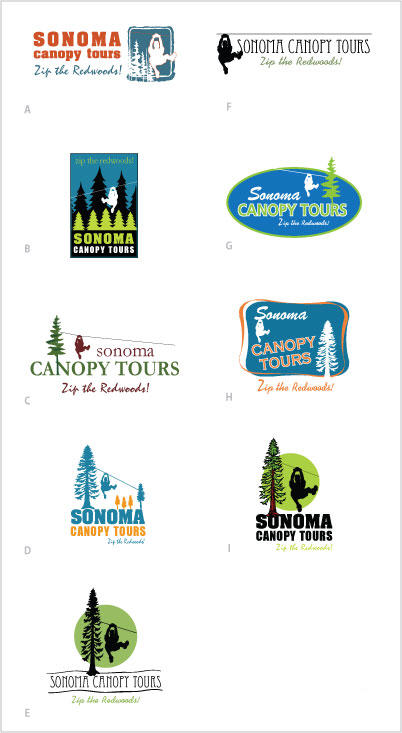
Spear Marketing Group was hired recently to develop the park’s branding and identity, messaging, collateral, Website, signage, and overall marketing plan. As an exercise in “socializing” prospective logos, here’s an array of options that have already been through one round of client feedback. Choose your favorite by voting in the poll below. If you’d like to explain your choice, remarks and suggestions are welcome in the comments section. (Note: comments are moderated.)
Feel free also to share the poll with friends, colleagues, and family using the “SHARE” button, which will allow you to add this post to Facebook or Twitter, or forward the information via email. Thanks in advance for your input. See you at the park!
UPDATE AND SPOILER ALERT: check out the client’s new Website to see the final design.
 |

I chose “G” but as someone mentioned on FB, it looks like the guy is going to run into the tree. I would move the tree to the top of the logo. I think this logo will look nice on shirts, stickers, etc. And is also classy and timeless. I really like “h” as well, but with the open areas on the logo and the “trendiness” of it, it is going to “date” faster.
I like C! The simplicity of the design looks the most timeless. It also looks the most timely for what’s currently in style–simple logos a la Apple. A lot of the other designs remind me of t-shirt logos (and that could be a potential application for some of them).
Mostly though, the color scheme and simple serif font in logo C communicate “Sonoma” and “wine country” unlike any of the other designs. This will be a draw to people who are spending a couple days in wine country, and want to make the short drive to the redwoods.
I voted for I because it looked clean, then I realized it also had the “Zip the redwoods” tagline. I really think the font used for this tagline is a bad idea. It’s very hard to read, and is almost invisible in B (my second preference). As a secondary comment, D immediately makes me think of PG&E’s logo – similar colors, similar general shape.
I was torn between c and b but ended up with c. I thought c was easier to read and the zip line was more obvious. …and for some reason the more traditional colors reminded me of Sonoma? The tag line comment about the font being tough to read is a really good point–they may need to revisit it. Producing promo goods with scripty fonts is not easy.
I voted for C for overall design. However, I like the size of the tree in D, E and I better, as it emphasizes the sheer size of the whole effort. Perhaps modify C by making the upper (branched) part of the tree a bit bushier and extending the trunk down to the baseline of the tag line? Also have to admit that I absolutely don’t care for the graphic representing the person. It strikes me as awkward and cartoonish.
I voted for “C” because it says it all at a glance – Canopy Tours – you don’t need to search for what they are selling. However, I believe, it would have all the right dimensions if it had the style of tree as in “D” with the smaller tree at the other end, use black lettering for Sonoma and change out the green for lime green and blue-for the zipliner and “zip the redwoods. It would be a win/win. It’s about time we have zip lining in the U.S. – Good for them!!!! We loved it in Costa Rica years ago.
I am in the custom apparel business, mostly embroidery.
I chose “C” because I think it fit well into an apparel program for the business – it is clean & crisp and has the right amount of open space in the design. It would lend it’s self to both screen printing and embroidery