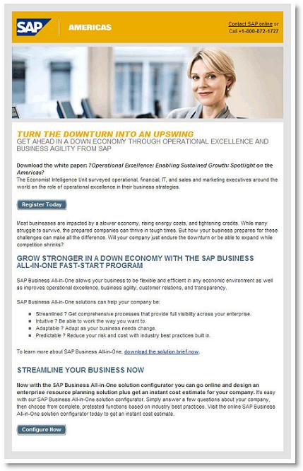
A few weeks back I savaged a Webinar invitation from Oracle, so it seems only fair that I critique an e-mail recently received from one of Oracle’s main competitors, SAP.
Oracle’s e-mail was ostensibly promoting an event; the SAP campaign is promoting … well, I’m not really sure. That’s because it contains three (3) distinct offers and more than five (5) separate calls to action. The e-mail is muddied, confused, and full of the type of clichés and business buzzwords that would make even Dilbert cringe.
 First, the design. Overall, the look is clean and professional, the call to action (well the first one, anyway) is prominent and above the fold, and graphics are minimal. The photo is engaging in the way that people shots are, though if you have images turned off in Outlook as I do, you get the usual white box. However, there is absolutely no reason to have generic contact information in the upper right corner. It has no relevance to the campaign and is distracting at best.
The headline is where things really start to unravel, and fast. I’m all for telling people how to prosper in a down economy, but “operational excellence and business agility”? Puh-leeze. Grab me with something specific, for pete’s sake. “Get ahead in a down economy through operational excellence and business agility from SAP” is no longer selling the offer, it’s selling SAP. And I’m not buying.
This is an e-mail confused on many levels. It doesn’t know whether it’s selling a product or content. It tells me to download a white paper, but then offers up a button that says “Register Today.” Register for what? It should say: “Download Now.” A minor point, I know, but little inconsistencies like this can cause the reader to hesitate. And if the reader hesitates, even for a split-second, you’ve lost him.
Read closely and you’ll find three offers: a white paper on operational excellence, a solution brief on SAP’s product, and finally, access to an online “solution configurator” (which, to this cynic, sounds more like an RFQ generator.) There are ways to present multiple content items in one e-mail – for example, as components of an information kit – but the key is to sell one offer (the kit), and to present one call to action. Here there are three offers, each with separate calls to action, and each with distinct selling points. There’s no cohesive, overarching benefit to responding, nothing that drives the reader to one, single action.
This is yet another example of what CDI’s Dave Dumanis wrote about in this space recently, namely utilizing tired, generic, corporate-approved positioning without much thought for whether the language really works in the context of a direct marketing campaign. Witness the bullet points that exclaim how SAP can help companies:
“Get comprehensive processes that provide full visibility across your enterprise”
Buzzword city. I won’t even pretend to know the value of “get comprehensive processes.”
Oh, and it gets worse. If I click on any one of the buttons, or the download link, I am transported to a landing page asking me to choose which assets I want to download (that’s right – I just told you which asset, but you’re asking me again) and then from there to a registration page when I can confirm my choice yet again (no, really) and fill out a form with 15 required fields, including complete mailing address. I’ve completed passport applications that were less work.
Visually, this campaign is an attractive piece of interactive design. Functionally, it needs a lot of help.

Howard, I agree with you on the “attractive piece of interactive design” if you’re just talking about the top banner colors.
But otherwise, my eyes have to do a lot of work. The text of each offer is not separated from the others in a consistent way, so it all mixes together.
(Not that there *should* be three offers here…the much bigger problem you note…but go with me here…)
The white paper offer starts with a headline and ends with the “Register Now” button.
Then there’s a paragraph which applies to both the “Fast Start”
offer and the Solution Configurator offer…but it’s placed in such a way that that’s not immediately clear.
Then the Fast Start text does *not* end with a button.
Then the Solution Configurator text *does* end with a button.
—
All of which, yes, is a lesser issue — even if the design *were* easy on the eye in every way, it would be for naught because of everything else you’ve pointed out.