For many B2B Marketers, advertising on LinkedIn is becoming a demand generation staple. At our agency, we’re seeing great results across a broad swath of clients from LinkedIn Sponsored Updates in particular, at a cost per lead similar to, or sometimes better than, traditional search marketing.
In addition to the potential for highly competitive metrics (click-through, conversion rates), advertising on LinkedIn offers another key advantage compared to SEM, namely the ability through audience definition to ensure that the only people who see your ad are those who meet a tightly defined target demographic. The result is fewer unqualified leads from people who would never buy your product.
The creative requirements for sponsored updates are simple – a few lines of text and a custom image. And perhaps it’s because of that simplicity that very few LinkedIn ads, in my view as a dedicated ad watcher, take full advantage of the channel with either copy or imagery that are truly engaging.
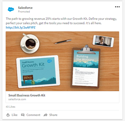
The ad below from CRM giant Salesforce.com is an exception. I don’t know the results (if someone from Salesforce reads this, please comment) but my educated guess is that it performs well. Here are the two key reasons why I think that is:

1. Ad copy
The copy for this ad is a triumph of brevity. It leads with a clear, quantifiable benefit (“growing revenue 25%”). It identifies the offer (“Growth Kit”) front and center. And then closes with a list of 3 actionable phrases that drive action (“get the tools you need to succeed.”)
2. Image
If you scan your LinkedIn feed today, I can almost guarantee that most of the images accompanying sponsored posts will be generic and uninspiring: a quick screen grab from the landing page, an offer thumbnail, perhaps some bland stock image with an equally ordinary tagline.
Here, the Salesforce folks have accomplished a design that is both unique enough to catch the eye as you scroll by, but also informative enough to engage the reader. What we see is actually an image of the offer, but rather than use some boring white paper cover, Salesforce created a desktop vignette that represents various elements of the “guide” being consumed – on a tablet, a clipboard, and a smartphone (the video at upper right).
Along with the faux desktop, coffee cup, and pen, each element adds a human flavor to a scene that otherwise would be just another information kit. In addition, showing the different elements makes the offer more tangible, and, therefore, more interesting.
This ad is also a reminder that images in LinkedIn updates aren’t limited to just the visual. If you’re promoting an event like a Webinar, for example, or perhaps a speaking slot at an upcoming conference, you would do well to include, as part of the image, basic information like date, time, presentation title, and speaker info.
For more tips on effective social advertising, download our free white paper: “Social PPC: Tips for Successful Ads on Twitter, LinkedIn & Facebook.”
