“Above the fold” is a term that originated in the heyday of print advertising and direct mail. Generally speaking, it’s a principle of advertising design that suggests that advertisers, in order to engage the reader and drive that individual to act, should present key selling information in a location within the ad that is immediately visible at first glance, one that doesn’t force that reader to take additional action (i.e. look below the fold.)
 Does a theory that predates digital marketing still have relevance today? In a word: yes. In fact, you could argue (as I will) that “above the fold” is even more important today than it was when most ads were actually, well, folded. Consider two factors:
1. Attention Span. It’s estimated that, in an era of information overload, the average person receives anywhere between 3,000 and 20,000 advertising messages a day. A typical business user receives more than 100 email messages alone daily, many of us much more. A high percentage of those messages are ignored, whilst the remainder is scanned at best. Grabbing the reader’s attention immediately has never been more vital.
2. Mobile Devices. The devices upon which a prospect receives your message are getting smaller and smaller (smartwatches, anyone?) As a consequence, the precise location of the “fold” in your message is a moving target based on how that message is received.
At a time when 40-50 percent of all emails are received on a mobile device, it’s more critical than ever that the key components of any email campaign — offer, key benefits, call to action — are immediately visible in the very first few lines of your message.
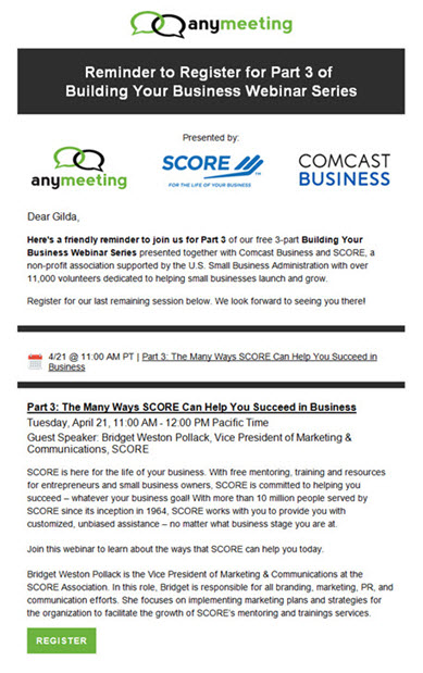
As an illustration, take the email at right from AnyMeeting, a provider of web conferencing and webinar services, promoting an upcoming Webinar event.
Everything you’d want to know about the event – where, when, why you should attend, how to register – is present in the invitation. Just one problem: none of that information appears in the top one-third of the email.
Instead, AnyMeeting have dedicated that prime top real estate to:
1. the AnyMeeting logo;
2. a headline that does nothing to promote the topic of the event or the key benefits to attending;
3. a row of sponsor logos; and
4. a first paragraph, perhaps the most critical part of the invitation, that describes one of the sponsors in detail but offers nothing by way of concrete benefits as to why someone would want to attend the Webinar.
 At right is a screenshot of how the campaign appears on an Android device. In this case, the “fold” as it were is at the end of the first paragraph, by which time (as detailed above) the reader has received no compelling information on why he/she should attend the event, or even why he/she should read further.
Here then is my modern version of “Above the Fold” for today’s B2B email marketers:
1. Whenever possible, avoid logos, large graphic headers, and other images that do little but push valuable selling copy down the page;
2. In the first one-third of the email (roughly equivalent to the headline, sub-head and first paragraph), the reader should understand very clearly the What, Why, and How of your campaign:
* What the offer is
* Why the reader should care, and
* How to respond.
In other words: the Offer, Key Benefits, and the Call to Action.
At the risk of piling on, it’s worth mentioning that even if you did have the patience and fortitude to read the entire AnyMeeting email, there’s still precious little by way of compelling reasons to register for the Webinar. Both the title of the event (“The Many Ways …”) and the description that follows is nothing more than promotional copy for one of the sponsoring organizations. Now, they may be a fine group of people, but when the sole reason to attend a Webinar is to learn why you should be doing business with one of the sponsors, you’re making an uphill battle even steeper.
For more tips on B2B email marketing, download a free copy of our white paper: “Top 10 B2B Email Marketing Mistakes”.
