A well-designed resource library can be a key factor in converting Website visitors to measurable, actionable sales leads. Conversely, a poorly designed resource library is where old white papers go to die. At worst, resource centers can be tough to navigate and difficult to search, leaving visitors frustrated and only too happy to seek their information elsewhere.
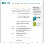
 Since our agency was founded, we’ve compiled a significant store of informational content, and so, like many companies, our site’s resource center quickly grew from a single page, relatively clean and easy to browse, to a veritable laundry list of white papers, ebooks, podcasts, videos and more. (See thumbnail at right.) Even though the site as a whole continued to generate a consistent stream of leads, we knew we could do better, so we set out to redesign the resource library with the following objectives:
1. Improve the user experience by making the library easy to browse, search and navigate.
2. Promote individual content items more effectively (and improve SEO) by including short descriptions visible at first glance.
3. Increase reach by adding the capability to like, share, rate, and comment on content items.
“In developing a new layout for the resource center it was important for us to focus on organization and scalability in the design,” says Laura McInerney, Spear Art Director. “We not only wanted to accommodate the existing resources, but also the many more that are on the horizon. In order to keep the layout scalable, simple, and intuitive, we added a categorization system to help users search by content type as well as category icons and a rating system to aid in scannability.“
Significantly, the decision was made to host the resource center on WordPress, to better enable the social sharing features that were to be a key feature of the new library. Comments Steve Reinhardt, Spear’s lead Web designer: “I’m a big fan of WordPress for its consistent updates and vast library of plugins. It was the ideal choice here, allowing us to empower user interactions like commenting, resource ratings, social network sharing, as well as any future functionality.”
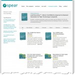
 The difference in the new design is striking. (See thumbnail at right, or view the new library here.) Though the look and feel remains consistent with the main site, content is now more accessible than ever. Visitors can search for topics or browse by content type. Ratings and comments add a new level of interactivity and entice visitors to view content that other users found useful.
Note: we made the conscious decision to continue to gate most content items behind their own individual landing pages. Since the pages are hosted in Marketo, a marketing automation platform, information on the registration forms is pre-populated for repeat visitors. Besides being able to track leads more effectively, we find that prospects will update and correct outdated contact information, allowing us to maintain the integrity of our CRM database more easily.
Since the new library just launched, it’s difficult to gauge at this stage what kind of difference the redesign has made. The hope and expectation is that it will increase lead flow significantly over time.
